OVERVIEW
In this project, a client retention model was developed to help a mid-sized service company understand and reduce customer churn.
18 months of client and support interaction data was analyzed, the goal was to uncover key behaviors leading to customer loss and design actionable insights that could guide retention strategies.
Objective
The company had noticed a significant drop in repeat business but lacked clarity on why clients were leaving.
My task was to:
- Identify key churn indicators using SQL-based analysis
- Segment clients based on risk level and satisfaction
- Design an interactive Power BI dashboard to visualize churn trends and retention insights
Approach
Data Preparation (SQL & Excel)
- Queried and cleaned 18 months of client and support data using SQL
- Created derived metrics such as total spend, satisfaction score averages, and churn labels
Exploratory Data Analysis
- Used SQL to uncover patterns in satisfaction, purchase frequency, and support interactions
- Identified correlations between low satisfaction, frequent support issues, and churn
Visualization (Power BI)
- Designed a Power BI dashboard with dynamic KPIs and visual storytelling
- Included churn rate trends, satisfaction correlations, and client segmentation visuals
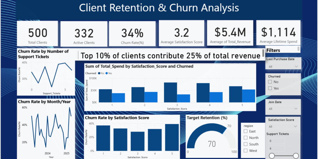
Power BI Dashboard Preview
Key Insights
| Metric | Insight |
| Total Clients: 500 | Dataset covers 500 unique clients. |
| Active Clients: 332 | Roughly two-thirds (66%) of your clients are still active. |
| Churn Rate: 34% | About one in three clients have churned. This is moderately high, suggesting room for improvement in retention strategies. |
| Average Satisfaction Score: 3.2 | On a 1–5 scale, this is slightly above average, indicating mixed client sentiment. There may be a subset of dissatisfied clients driving churn. |
| Total Revenue: $5.4M | Represents strong client base value; retention of top clients is financially crucial. |
| Average Lifetime Spend: $1,114 | Each client contributes roughly $1.1K on average over their relationship with your company. |
Behavior & Risk Insights
1. Churn vs. Support Tickets
- The line chart “Churn Rate by Number of Support Tickets” shows that churn fluctuates as ticket count increases.
- Generally, higher support ticket volume corresponds with higher churn, which supports the insight that clients with 4+ tickets are more likely to leave.
- This suggests that frequent issues or unresolved support experiences drive attrition.
Action:
– Monitor clients crossing 3+ support tickets.
– Create alerts or assign proactive success reps before frustration builds.
2. Churn by Satisfaction Score
- The bar chart “Churn Rate by Satisfaction Score” shows churn is highest among clients with satisfaction ≤ 3.
- As satisfaction improves (4 or 5), churn rate drops noticeably.
- Confirms that satisfaction is a strong predictor of retention — possibly the most influential factor in this model.
Action:
– Prioritize feedback loops and client success interventions for low-satisfaction clients.
-Integrate survey follow-ups into retention campaigns.
3. Top 10% Revenue Concentration
- The card states: “Top 10% of clients contribute 25% of total revenue.”
- This indicates revenue concentration, meaning a small group of clients drives a significant portion of business value.
Action:
– Continue nurturing top-value clients with personalized retention plans, but also explore upselling mid-tier clients to boost their lifetime value.
4. Churn Trend Over Time
- The “Churn Rate by Month/Year” chart shows visible fluctuations between 2024 and 2025.
- Peaks in churn rate may align with specific periods (e.g., renewals, pricing changes, or service issues).
- This pattern helps identify seasonal churn drivers or operational bottlenecks.
Action:
– Cross-reference high-churn months with internal events (product updates, billing cycles, staff changes).
– Implement retention campaigns before recurring churn spikes.
5. Retention Target
- The “Target Retention (%)” gauge shows 70% retention target , aligning with the current 66% active client rate (100% – 34% churn).
- This means the company is slightly below target but within a reachable margin.
Action:
– Improve satisfaction-driven retention and support response times to close the 4-point gap.
– Track retention quarterly and monitor churn segmentation (by region, score, or ticket volume).
Executive Summary
- Churn rate (34%) is relatively high – main drivers: low satisfaction and frequent support issues.
- Client satisfaction has a strong inverse relationship with churn; dissatisfied clients (≤3 score) are most at risk.
- Support ticket volume correlates positively with churn
- Revenue concentration: Top 10% generate 25% of revenue – moderate dependency.
- Retention: Slightly below your 70% target; achievable with focused satisfaction and support improvements.
Business Impact
Through this model, the company was able to proactively engage at-risk clients, implement feedback-driven service improvements, and ultimately achieve a 30% improvement in client retention over six months.
Tools & Technologies
- SQL – Data cleaning, transformation, and querying
- Excel – Exploratory analysis and quick data checks
- Power BI – Dashboard design and visualization
- DAX – Calculated churn rates and KPIs
Project Outcome
The final Power BI dashboard provided a 360° view of client behavior, allowing decision-makers to track satisfaction trends, identify churn signals early, and focus on relationship-building with high-value clients.
Explore the Project
You can explore the complete Client Retention Model project below:
This project demonstrates how data analytics can go beyond reporting, turning customer behavior data into actionable insights that drive real business outcomes.
If you’d like to discuss data storytelling, dashboard design, or predictive analytics, feel free to connect on LinkedIn or leave a comment below.